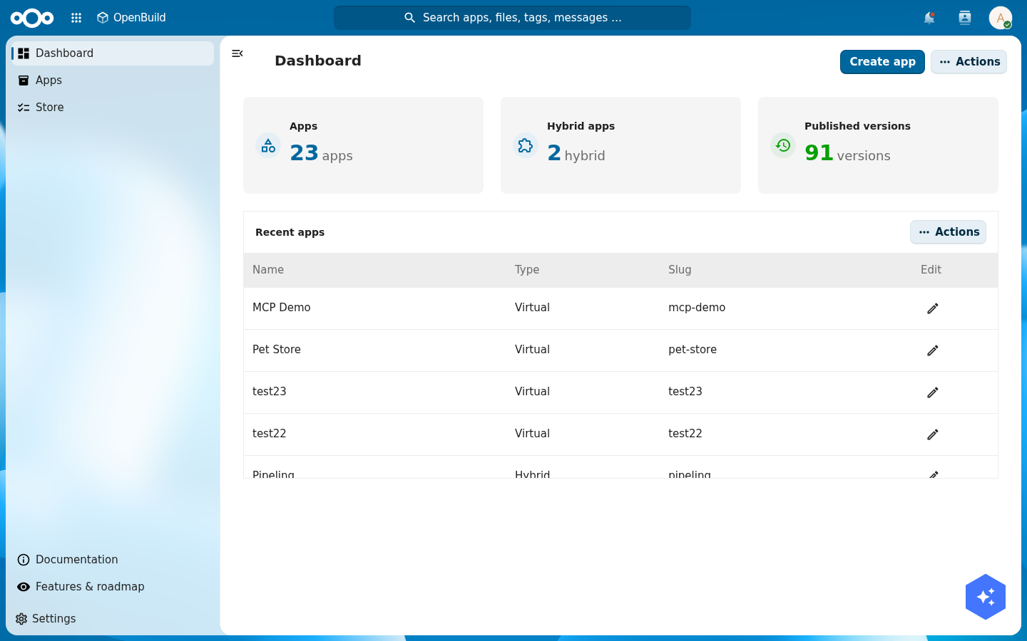
Build a Nextcloud app with OpenBuild, no code required
Build a complete Pet Store app inside Nextcloud without writing a line of code. You will create the app, design its data model, seed it with demo data, compose a dashboard from every widget type, give a vets group its own medical layer, release a production version, surface the app on the LaunchPad dashboard and in search, link vet visits to Calendar, drop files onto a pet, add business-logic flows that book a vet inspection and email the vet when a pet is registered, and learn how an AI agent can build the whole app over MCP. OpenBuild is the visual builder for the same manifest the code path teaches; here you author it by clicking, not by editing JSON.
OpenBuild is the visual builder for Conduction apps. The three-paths tutorial teaches the manifest path by hand: you write manifest.json and the Cn* components render it. OpenBuild builds that exact same manifest for you through a UI. You point and click, OpenBuild writes the manifest and the OpenRegister schemas behind it, and you get a working Nextcloud app with no repository, no build step, and no deploy.
This tutorial builds a Pet Store with a veterinary layer, the canonical Conduction sample domain. By the end you have an app your whole organisation can open: a dashboard of live numbers and charts, browsable lists of pets and owners, a rich pet profile page, a vets-only medical section, a released production version, a widget on everyone's LaunchPad, vet appointments in Nextcloud Calendar, and photos attached to each pet. Everything in this tutorial is built in the OpenBuild UI against a real OpenRegister behind it.
If you want to understand what OpenBuild is writing for you under the hood, skim Part 0: three paths first. It explains the manifest and the nextcloud-vue component library that OpenBuild drives.
Step 1: Create the app and give it a paw
Open OpenBuild from the Nextcloud app menu and choose Create app. Give it a name (Pet Store), a short description, and pick Virtual as the type. A virtual app lives entirely in OpenBuild; it has no installed Nextcloud counterpart.
Once the app exists, open its settings and upload an icon. A pet store wants a paw. Drop a 24x24 SVG into the light icon slot (and a white version into the dark slot for dark themes). OpenBuild stores the icon against the app and serves it at /apps/openbuild/icons/pet-store.svg.
Verify: the app appears in the OpenBuild app list with its paw, and opening it shows an empty shell with your app name in the navigation.
How you author: the edit menu and edit mode
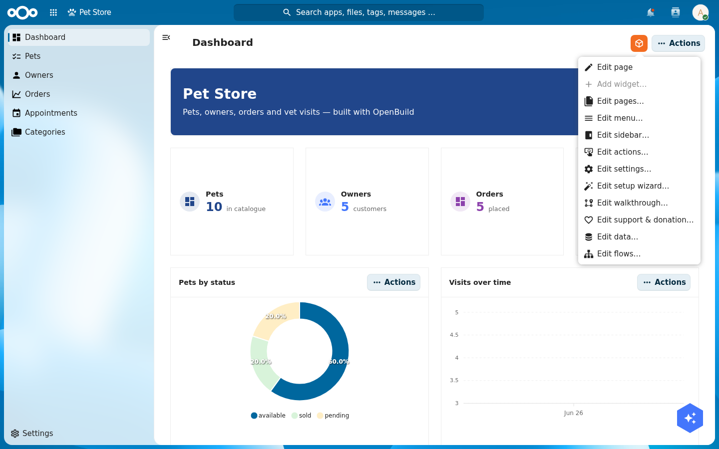
Everything in this tutorial is built inside the running app, through one control. Open your app and look at the top-right of any page: the orange OpenBuild button. Click it and a menu drops down. This is your whole authoring surface. You never leave the app to edit it.
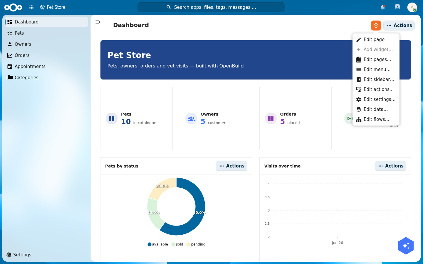
Each entry opens a focused editor, and the rest of this tutorial is really just "open the edit menu, pick the right entry":
- Edit page: toggles edit mode on the page you are looking at (see below).
- Add widget…: adds a widget to the current dashboard or detail page (enabled only in edit mode).
- Edit pages…: add, rename, re-type, re-route and nest the app's pages (Step 4).
- Edit menu…: add and reorder the left-navigation entries (Step 4).
- Edit sidebar… / Edit actions… / Edit settings…: tailor the current page's right sidebar, its action buttons, and the settings ⚙ foldout ("Tailor the chrome", below).
- Edit data…: create the register and schemas; set each schema's icon and searchable flag (Step 2).
- Edit flows…: add no-code business logic to a schema (Step 10).
Edit mode, the grid, and the cogs
For pages made of widgets (dashboards and detail pages), choose Edit page. The page enters edit mode: every widget grows a small cog in its corner, and the page becomes a grid you can rearrange.
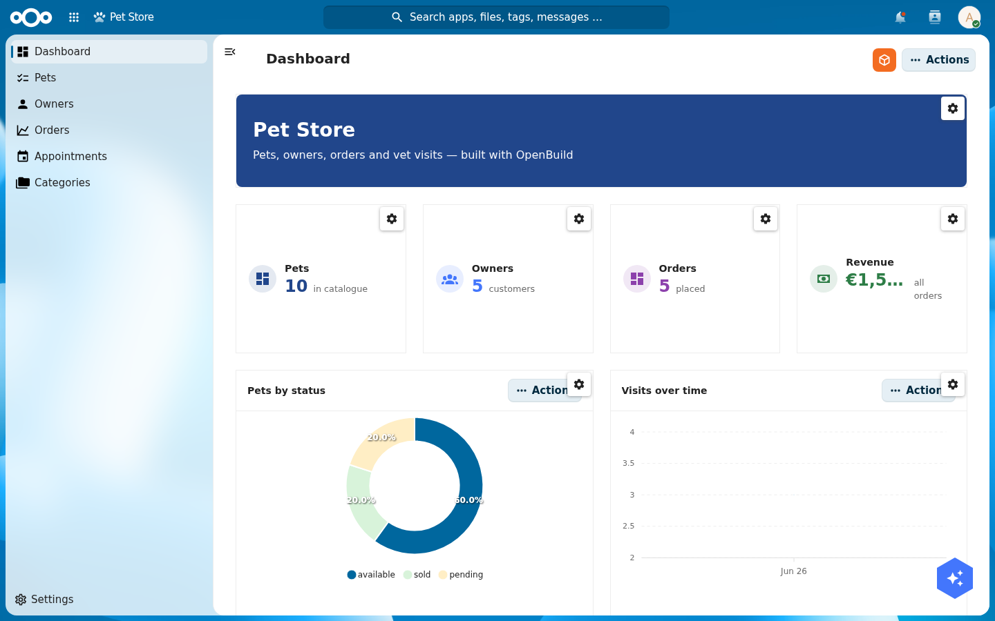
- Move / resize: drag a widget to reposition it, or drag its edges/corners to resize. OpenBuild uses a 12-column grid (GridStack) under the hood, so widgets snap into a tidy layout and never overlap. Your positions are stored on the page.
- Configure: click a widget's cog to open its settings (data source, labels, colours, format; see Step 5).
- Add: with edit mode on, use Add widget… from the orange menu.
- Save / cancel: the orange button now reads Save page (keep your layout) or Cancel (discard). Until you save, nothing is committed.
With that one mechanic (orange button → an editor, or Edit page → cogs and a grid) you can build the whole app. The steps below show each editor in turn.
Step 2: Design the data model
A Pet Store needs more than pets. From the orange menu choose Edit data…. This opens the data editor: it shows the app's register and its schemas, with an Add schema button and a pencil to edit each one. (The data editor talks straight to OpenRegister: schemas are real OpenRegister schemas, not an OpenBuild-only construct.)
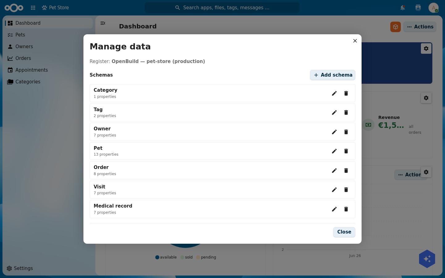
Create these seven schemas. For each one, add the properties listed, then add the relations.
| Schema | Key properties | Relations |
|---|---|---|
pet | name, species, status, sex, dateOfBirth, weightKg, microchip, price, photoUrl, description | owner (to owner), category (to category), tags (to tag, many) |
owner | firstName, lastName, email, phone, address, city | pets (to pet, many) |
category | name, icon, description | |
tag | name, color | |
order | orderNumber, quantity, shipDate, status, total, complete | pet (to pet), customer (to owner) |
visit | date, reason, vet, status, cost | pet (to pet), medicalRecord (to medicalRecord) |
medicalRecord | date, diagnosis, treatment, notes, weightKg | pet (to pet), visit (to visit) |
A relation property is a string with format: uuid and an x-openregister-relation marker pointing at the target schema. OpenBuild's schema editor adds that for you when you pick "relation" as the property type and choose the target.
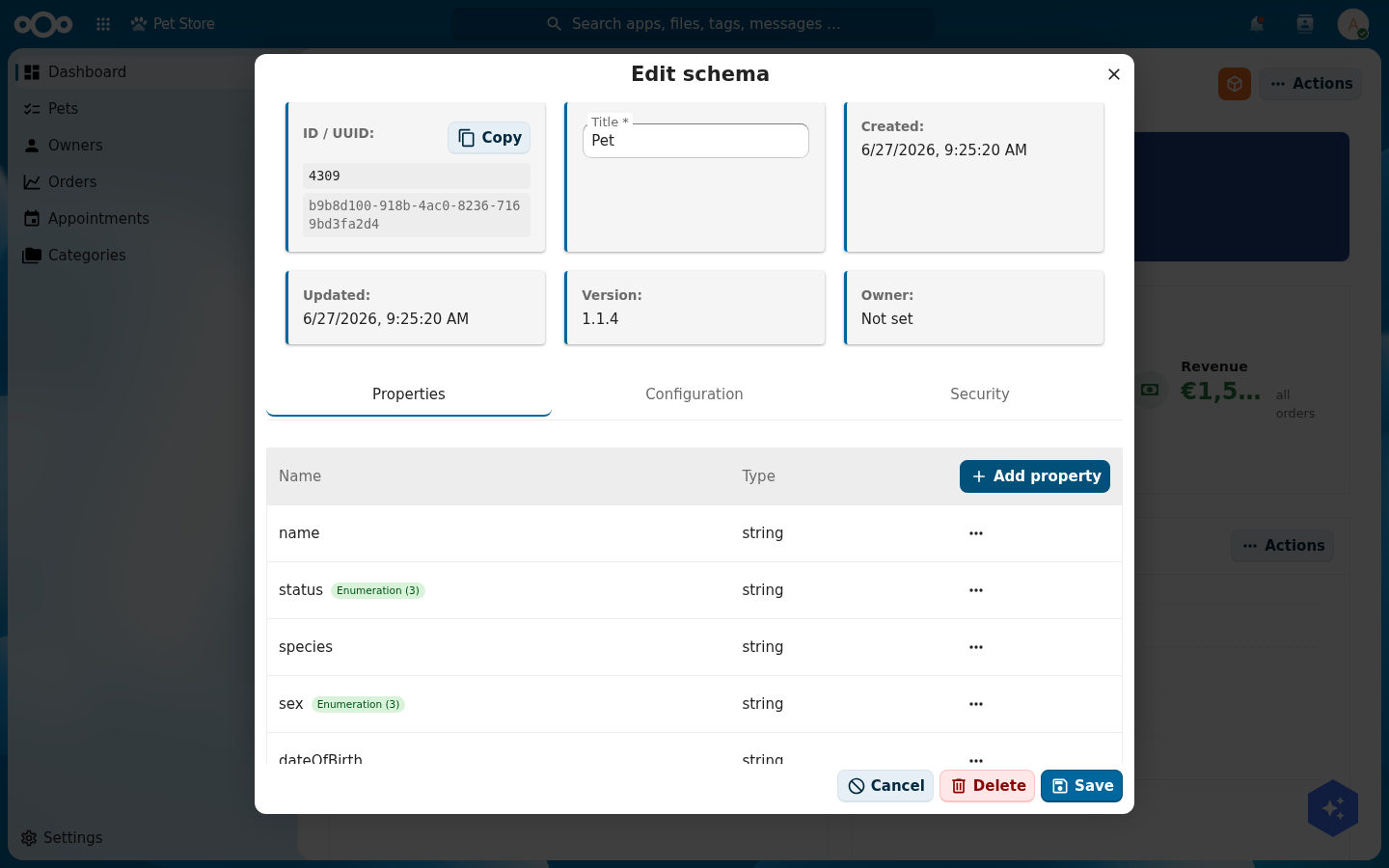
x-openregister-relation marker for you.The schema editor has three tabs: Properties (the fields, above), Security (which groups may read/write, used in Step 6), and Configuration. Open Configuration to set the schema's identity and how it behaves across Nextcloud:
- Icon: a Material Design Icon name (e.g.
Dogfor pets,Accountfor owners). It is shown next to the schema's objects in lists and in Nextcloud's unified search (Step 9). - Searchable: when on, this schema's objects appear in Nextcloud's top-bar search (Step 9). Turn it on for pets.
- Description, slug, summary, the object name/image fields, and the composition (
allOf/oneOf/anyOf) also live here.
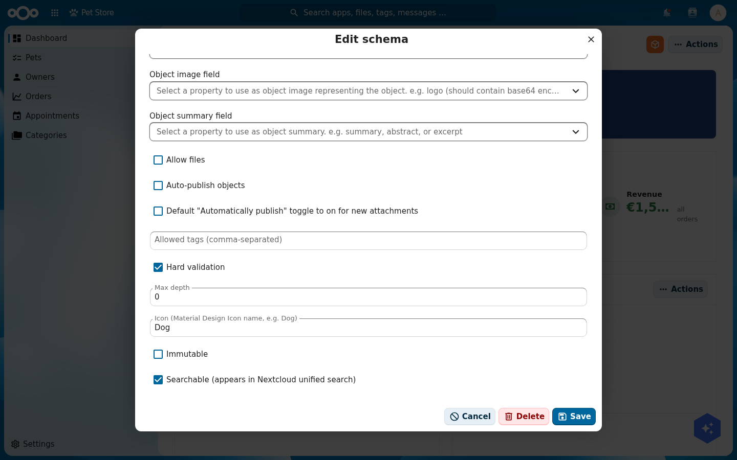
Dog) and turn on Searchable. These two settings make a pet show, with its icon, in Nextcloud search (Step 9).OpenRegister resolves a schema by the lower-cased slug. order and category are common slugs that may already exist in another app on your instance. If your order page shows the wrong fields, your schema collided with a global one. Reference the schema by its numeric id in the page configuration, or give the pet-store schema a unique slug like petorder.
Verify: all seven schemas show in the schema list, and the pet schema lists owner, category, and tags as relations.
Step 3: Seed rich demo data
An empty app is hard to judge. Add real-looking content so your dashboard and lists have something to show. Through the app's index pages (Step 4) or the OpenRegister object API, create roughly:
- 4 categories (Dogs, Cats, Birds, Reptiles) and 5 tags (Friendly, Vaccinated, Neutered, Senior, Puppy).
- 5 owners with names, emails, and cities.
- 10 pets across the species, each with a status (
available,sold,pending), a price, a weight, and an owner, category, and tags. - 5 orders with totals and ship dates, each linked to a pet and a customer.
- 6 vet visits with reasons, vets, costs, and statuses, linked to pets.
- 5 medical records linked to pets and visits.
Good demo data has variety: a sold beagle, an available parakeet, a pending kitten, a cancelled skin-allergy visit. Variety is what makes the charts in Step 5 worth looking at.
Verify: the OpenRegister object count for pet reads 10, and a pet object has its owner, category, and tags filled with the UUIDs of the objects you created.

Step 4: Build the lists and a rich detail page
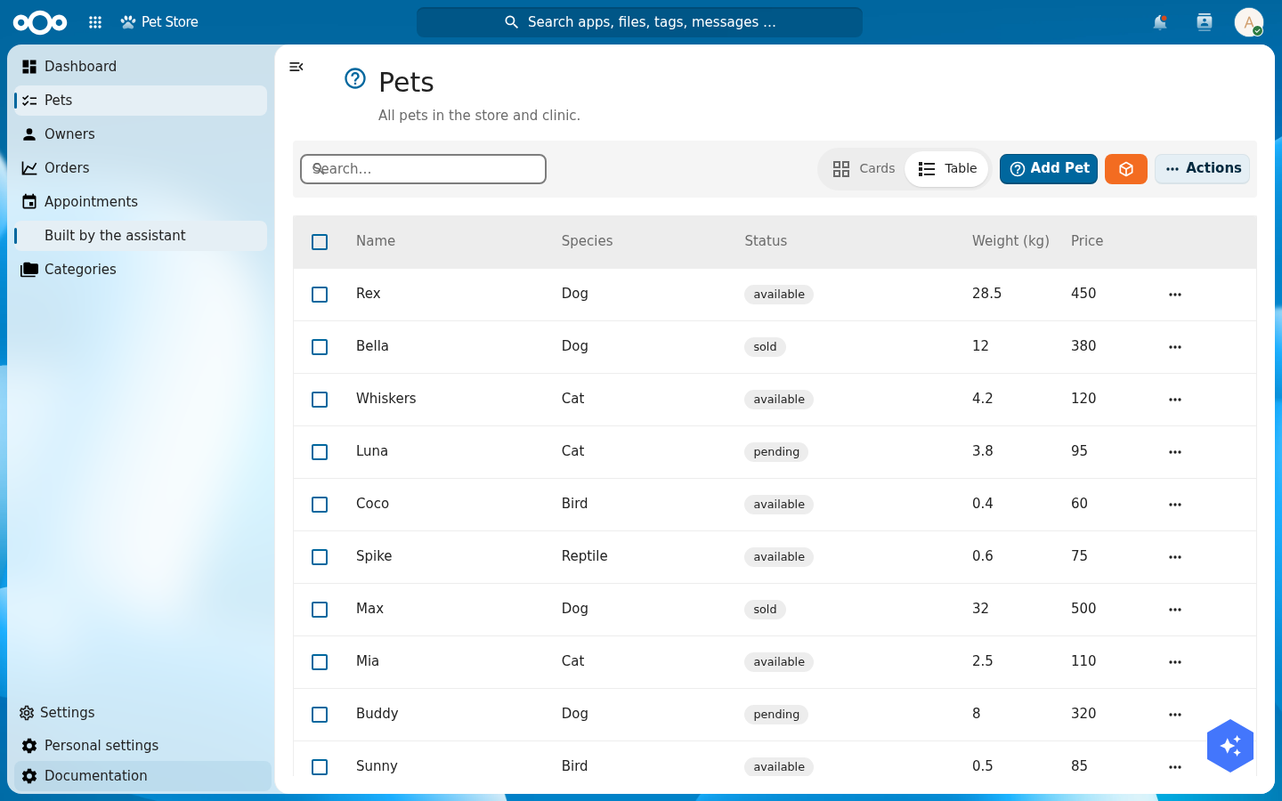
Now give the app pages. From the orange menu choose Edit pages…. Click Add page, then open the new page's gear to set its Title, its Type (Index for a browsable list, Detail for a single object, Dashboard for a widget grid), its Slug, and its Route. Add an index page for each schema you want browsable: Pets, Owners, Orders, Appointments (the visit schema), Categories. (For an index page you then pick the register, schema, and columns on its own configuration; the Pets list, for example, shows name, species, status, weight, and price.)
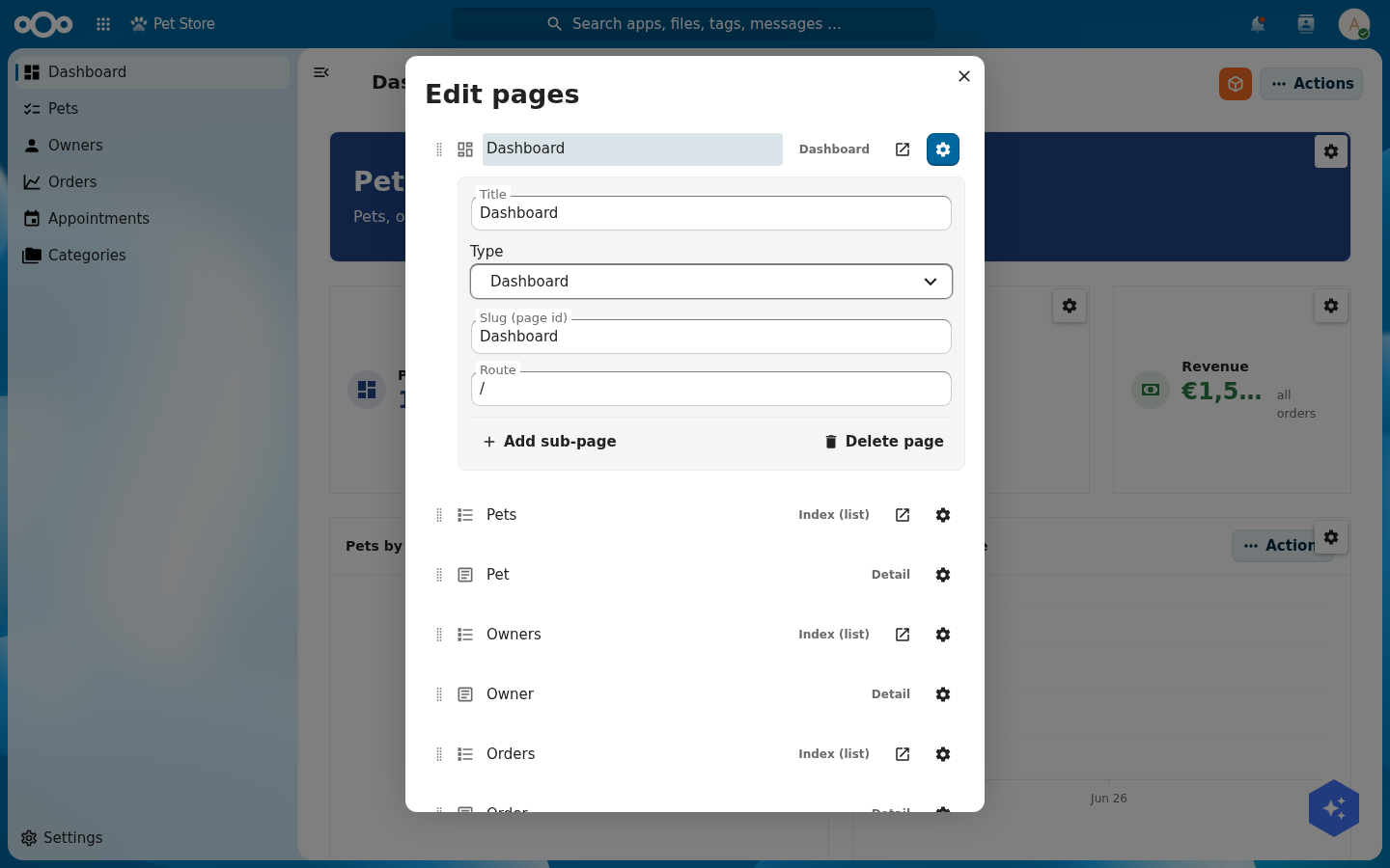
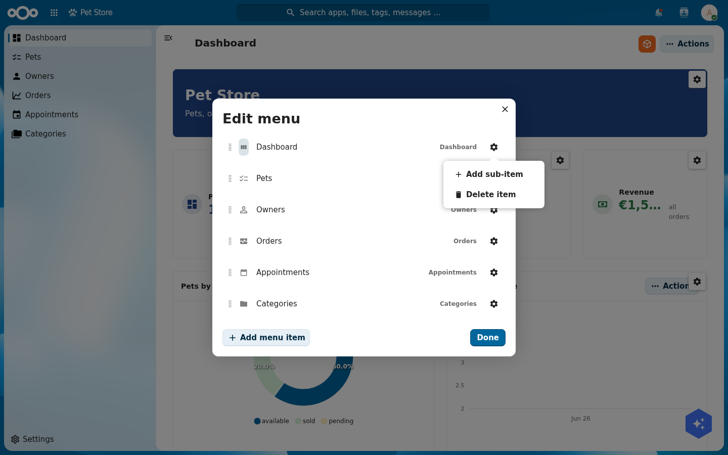
Now make the pages reachable. Choose Edit menu… and click Add menu item for each page you want in the left navigation; each entry's gear sets its label, icon and target route, and you can drag entries to reorder them or Add sub-item to nest them one level deep.
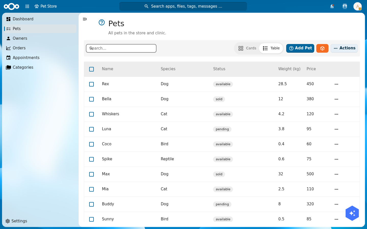
Verify: each index page lists its objects, the search box filters them, and the card/table toggle switches layout.
Build a specialised detail page, where OpenBuild shines
A list gets you to an object. The detail page is where the work happens, and it is where OpenBuild earns its keep. A detail page is a grid of widgets bound to one object, composed exactly like the dashboard: open the page, choose Edit page to enter edit mode, then Add widget…, drag on the grid, and tune each widget through its cog (Step 5). A good detail page is not one generic form. It is a deliberate mix of widgets that fits the domain. That mix is what makes an app feel built for its job, and it is all configuration.
Open a pet from the Pets list to land on its detail page. The pet profile below is four widgets: a header banner, an editable data grid, a files drop zone, and a related-objects panel.
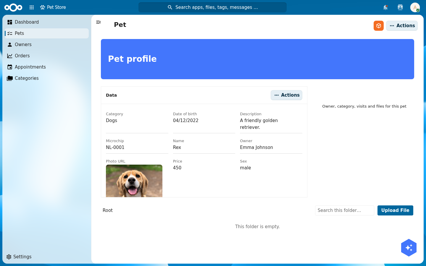
The widget palette. In Add widget… the Widget type dropdown lists everything you can place. For a detail page the workhorses are Object data (the property grid), Files (a drop zone bound to the object), Object relations (everything linked to it), and Object list / Table (a focused sub-list). Framing widgets (Header banner, Label, Image, Divider, Container) give it structure, and the dashboard data widgets (Statistic, Chart, Gauge) work here too, scoped to the one object.
A header banner
Add a Header banner widget for the title strip ("Pet profile"). It is pure chrome: set its title and background, no data binding. It anchors the page and carries the page actions.

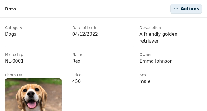
The data widget: an editable property grid
Add an Object data widget and point it at the pet's register and schema. It renders every property as a label/value pair in a grid, and it is editable in place: click a value, change it, save. No separate edit form. Use its cog to reorder properties, hide some, change a field's input type, or set a field's column span. This one widget replaces a hand-built form and its validation.
A file-upload field: the Files widget
Add a Files widget so staff can attach photos and certificates to the pet. It renders as a drop zone with an Upload File button, bound to this object's folder in Nextcloud Files (visible at the bottom of the page above). Drop a vaccination certificate on it and the file is stored against the pet: structured fields live in the data widget, documents live in the files widget. That is the whole "file-upload field": one widget, no upload code, no storage to wire.

A related-objects table: the Object relations widget
Add an Object relations widget. It gathers everything linked to the pet (its owner, its category, its tags, its visits and its orders) into grouped, clickable rows, resolving each relation's UUID to the real object's name and icon. It is the cross-link table that turns a detail page into a hub instead of a dead end. There is no query to write: the widget reads the schema's relation properties (and the objects that point back) and lists them.
A list of agenda items: the Object list / Table widget
Often a detail page needs a sub-list: this pet's upcoming visits, this owner's pets, this order's lines. Add an Object list (or Table) widget, point it at the related schema (visit), filter it to the parent object, and sort by date. The very same widget, pointed at the visit schema with no parent filter, is the standalone Appointments page, a clean agenda of vet visits:
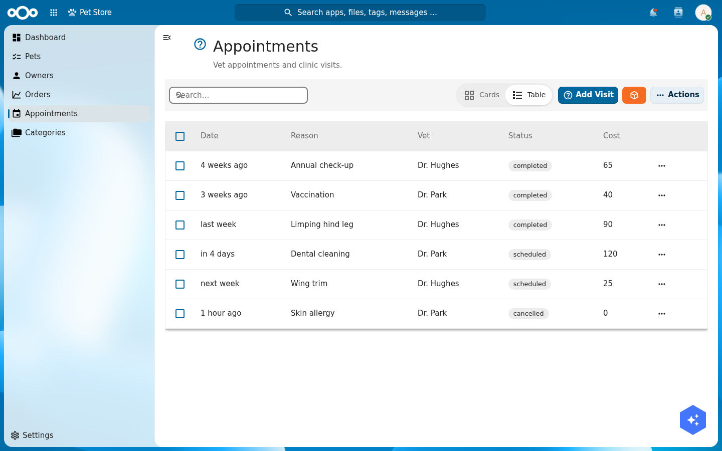
visit schema: a list of agenda items with relative dates ("in 4 days", "next week"), the vet, a status badge and the cost. The columns, the relative-date formatting and the status badges all come from the schema.Putting it together
Every widget here is added from the same Add widget… menu, dragged onto the grid, and tuned through its cog. Compose them with intent: a header for identity, a data widget for the facts, a files widget for documents, a relations widget for context, and one focused list for the sub-collection that matters. Five widgets, no code, and the page reads as if it were built for pets specifically, because it was.
Verify: clicking a pet opens its detail page with the header, the editable property grid, the Files drop zone, and its related objects; dropping a file on the Files widget attaches it to that pet, and the Appointments page lists every visit with its status.
Step 5: Compose a dashboard from every widget
Add a dashboard page (Edit pages… → Add page → Type Dashboard) and set it as the app's home. A dashboard is a free grid you fill with widgets. Use the full set so the store has a real cockpit:
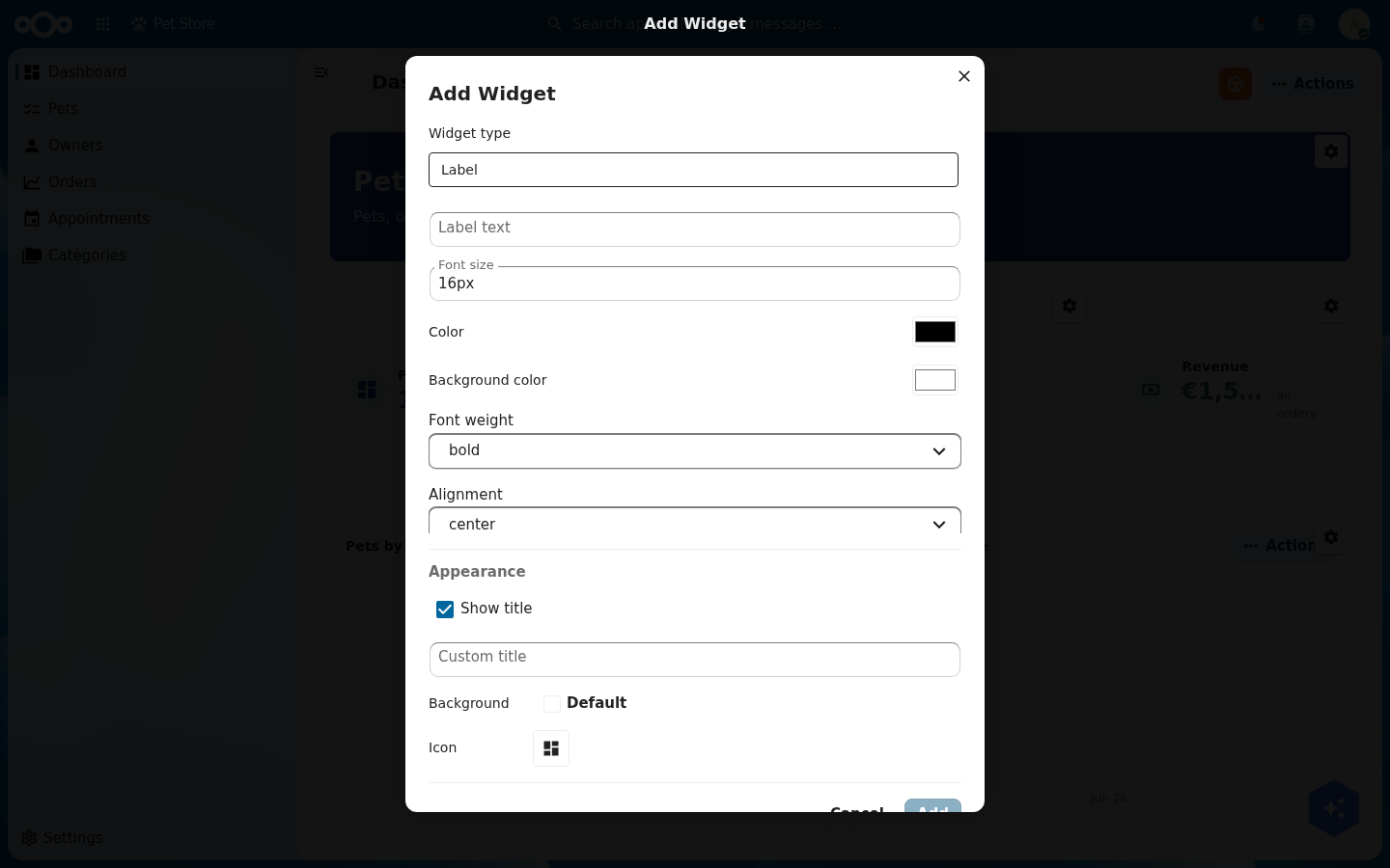
Adding a widget. With the dashboard in edit mode (orange button → Edit page), choose Add widget…. Pick a Widget type and the form changes to match it: a Stat asks for a data source and a label; a Label asks for text, size and colour; every type ends with an Appearance section (show title, background, icon). Click Add and the widget drops onto the grid, where you can drag it into place.
Configuring a widget. Every data widget asks for a register, a schema, and a metric. You set these on the widget's cog (visible in edit mode). A revenue stat is aggregation sum over the order schema's total field; a "pets by status" donut groups the pet schema by its status field; a gauge for pets sold counts pet where status = sold against a static target. None of this is code; it is a form per widget.
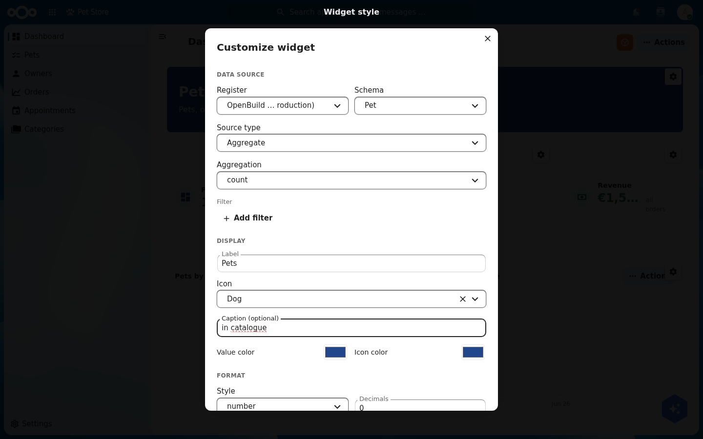
pet schema and shows the Dog icon.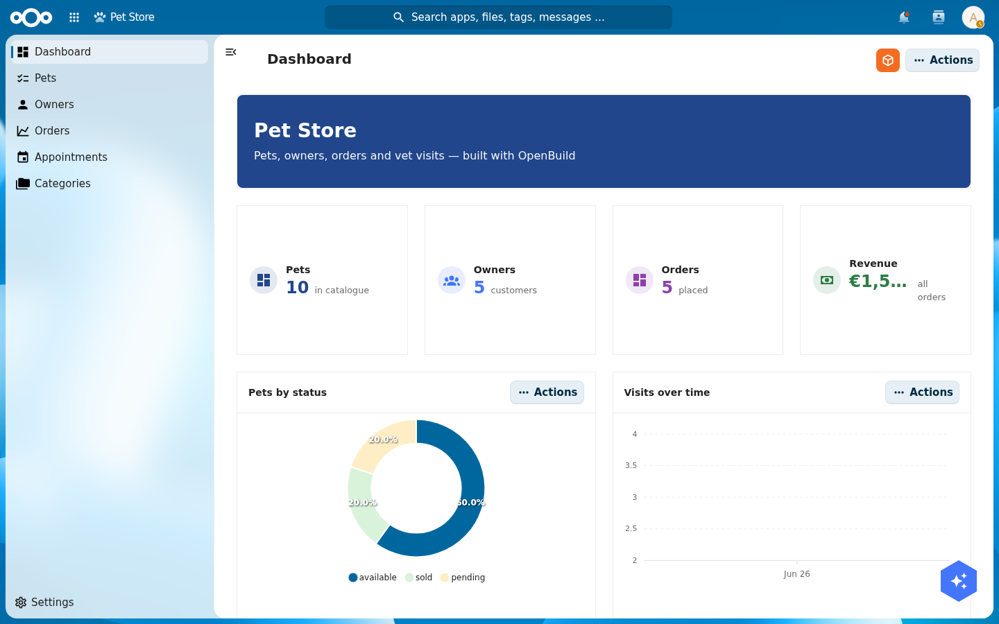
A chart is either over time (pick a date field and an interval, like visits per month) or by category (pick a field to group by, like pets per status). Choose the mode that matches the question you are answering.
Verify: open the app. The dashboard shows real numbers (Pets 10, Owners 5, Orders 5, a non-zero Revenue) and the donut renders coloured segments for each status.
Tailor the page chrome: sidebar, actions, settings
The same orange menu has three more editors for the page "chrome" around your content. Each works like the menu and pages editors (a small modal with Add… and a per-row form) and each saves into the manifest.
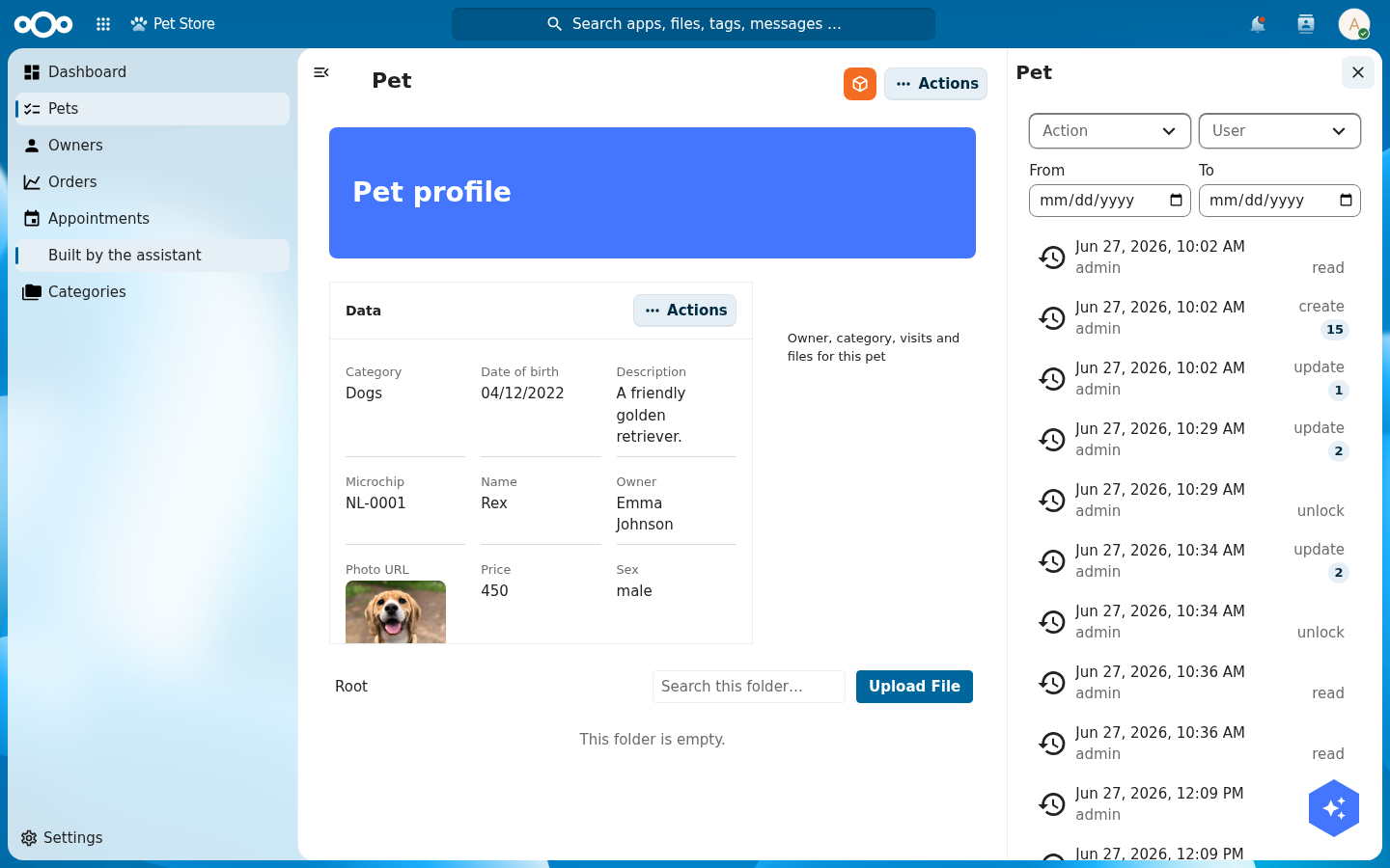
Edit sidebar… toggles a right-hand sidebar on the current page and manages its tabs. Open it on the Pet detail page, switch Show sidebar on this page on, click Add tab, name it "Logs", and set its Content to Audit log. A tab can show object data, metadata, or the audit log; leave content blank for an empty tab you fill later.
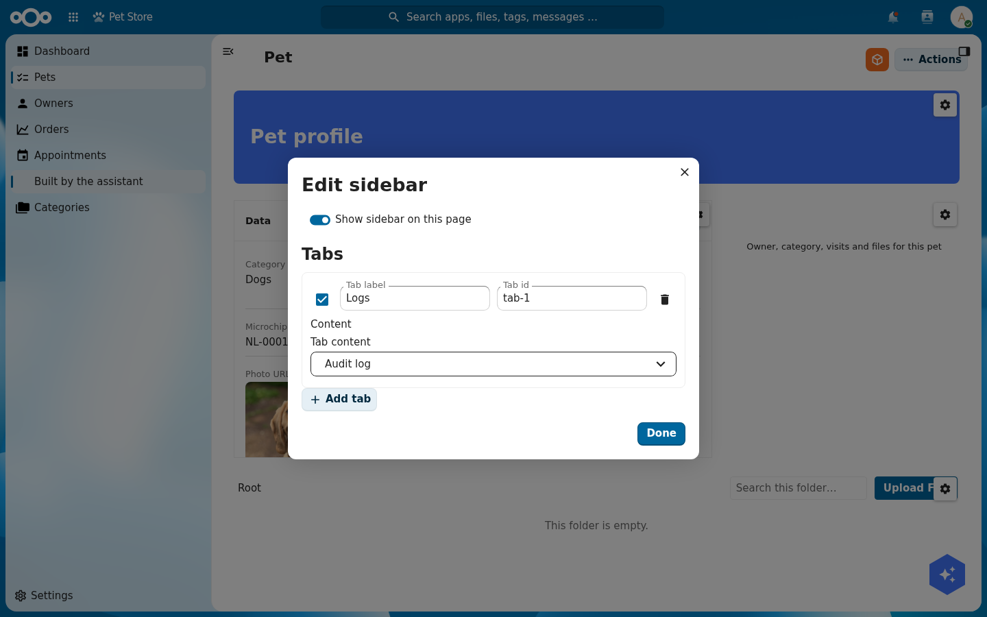
Click Done, open a pet, and open the sidebar from its header. The "Logs" tab shows the object's real audit trail: who changed what and when, with filters and load-more.
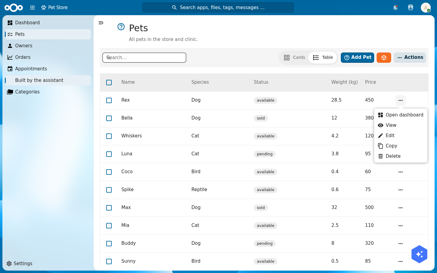
Edit actions… manages the per-row action menu. Add action gives each entry a Label, an Icon, a Type (e.g. open a page) and a Target. Add one labelled "Open dashboard" that opens the dashboard page.
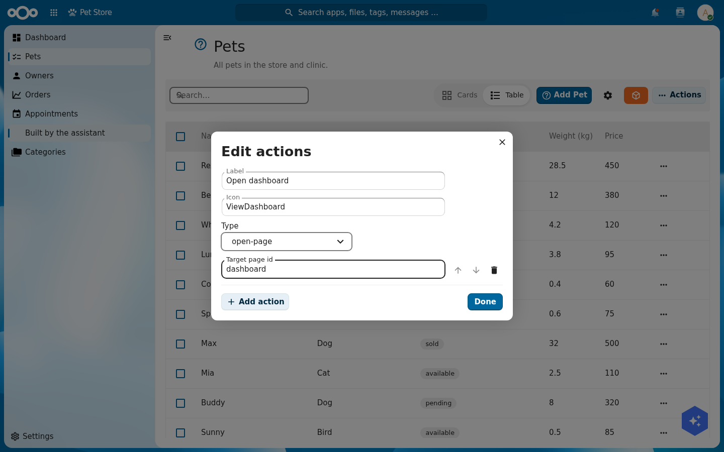
Click Done and open a pet's row actions on the Pets list: "Open dashboard" sits at the top, alongside the built-in View, Edit, Copy and Delete.
Edit settings… builds the settings ⚙ foldout at the bottom of the navigation. Add settings item, name it "Documentation", and point it at the dashboard page (icons and a "Personal settings" entry are optional).
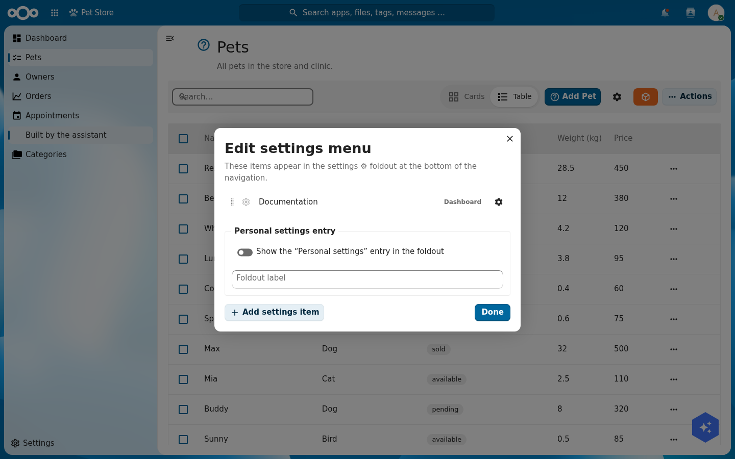
Click Done and open the Settings foldout at the foot of the navigation: "Documentation" is there, ready to click.
Step 6: Give the vets their own medical layer
The medical records are sensitive. Only a vets group should read them, and only vets should see the medical part of the app. The important rule: hiding a menu is not security. The data itself must be protected.
First, the data. As admin, create a Nextcloud group vets and put your veterinary users in it. Then open the medicalRecord schema's permissions and set the read (and create, update, delete) groups to vets. OpenRegister now enforces this on every request: a user in vets reads medical records, a user outside it reads none, and admins keep full access.
Verify it for real. From Nextcloud's user settings, create one user in the vets group and one outside it. Sign in as each and open the Pet Store: the vet sees the medical records and the medical menu, the other staff member sees neither, and an admin always sees everything. Two logins, no code.
With the data locked down, you can now scope the navigation: tag the medical menu item (and an optional vet dashboard page) so the app only shows them to the vets group. The menu scoping is the presentation layer; the OpenRegister permission above is the wall.
Troubleshooting
The non-vet user also sees zero pets, not just zero medical records. That is tenant isolation, a separate OpenRegister control: a user only sees objects in an organisation they belong to. Add both users to the app's organisation so the only difference between them is the medical permission.
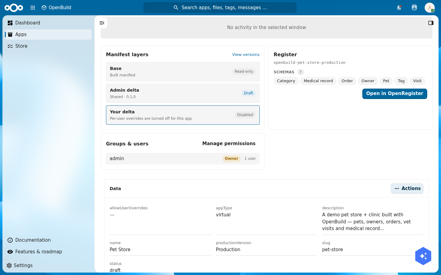
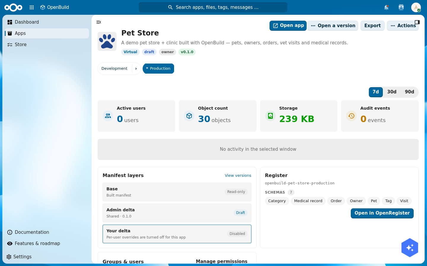
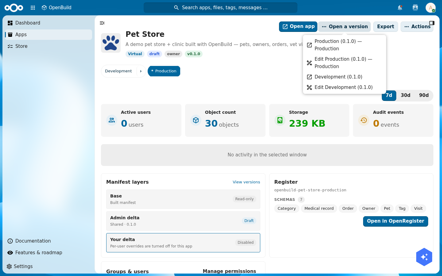
Step 7: Release a production version
You have been building in the open. Before colleagues rely on the app, cut a production version so you can keep editing without changing what they see.
OpenBuild versions an app the way OpenRegister versions any object. Open the app's version history. The version you have been editing is the draft. Use release to mark it as production. From now on there is exactly one production version at a time; "Open app" always opens that one.
To keep working, open a non-production version from the version list and edit there. Your colleagues stay on production until you release again. This is how you separate development from what is live, without a second instance.
Verify: the version history shows one version marked as production, and opening the app from the app list lands on it.
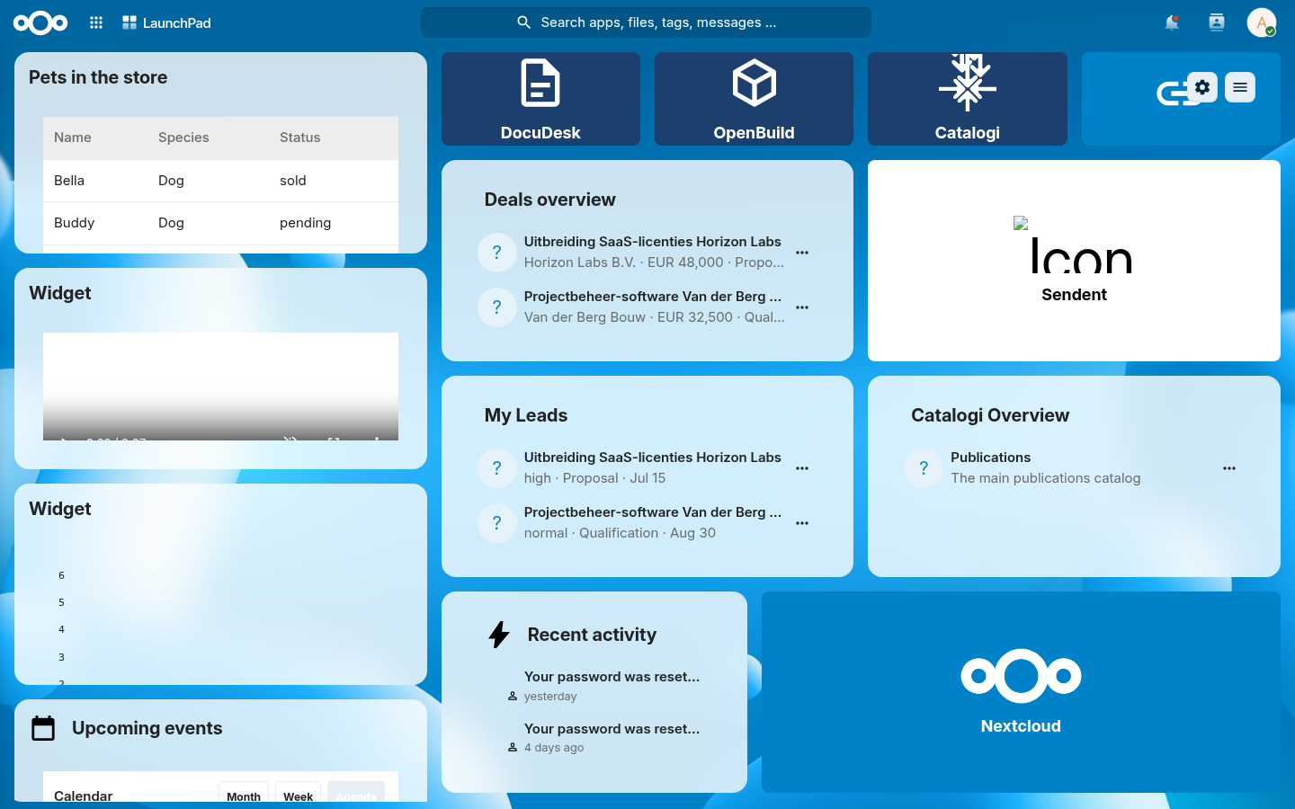
Step 8: Put the store on everyone's LaunchPad
LaunchPad is the personal Nextcloud dashboard. Surface the Pet Store there so it is one glance away. Open LaunchPad, choose Add custom widget, pick Object list, and point it at the Pet Store production register and the pet schema. Add columns for name, species, and status, give it a title, and save.
Verify: the LaunchPad widget lists your pets with their species and status, and updates when you add a pet.
Step 9: Find pets in search, link visits to Calendar, drop files on a pet
Three Nextcloud-native touches finish the app. Each one is a small piece of configuration that hands you a platform feature.
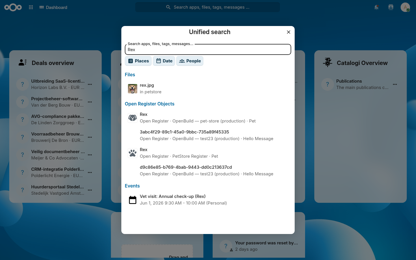
Search. In each schema you want findable, turn on the searchable flag. OpenRegister exposes those objects to Nextcloud's unified search through one fleet-wide provider, so a pet becomes a result in the top-bar magnifier next to files and messages. You write no search code.
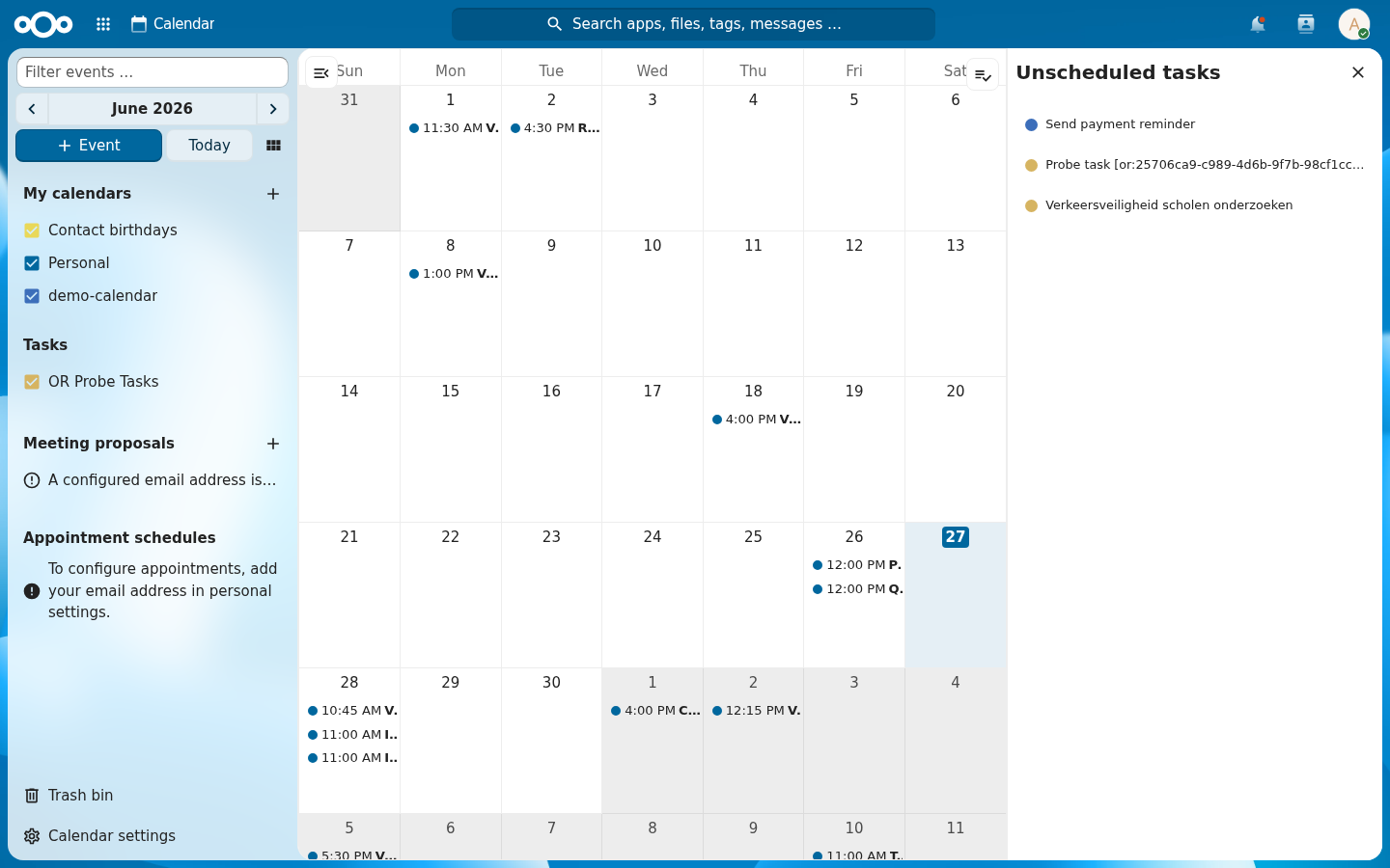
Calendar (the leaf). A vet appointment is an event, so it belongs in Calendar. OpenBuild ships a Calendar integration for the visit schema: open a visit's detail page and use its calendar action to book the appointment, and the next step's flow books a new-pet inspection automatically. Open Nextcloud Calendar and the appointments are there; the Related widget on a visit's detail page lists its event. Calendar is the right leaf for an event, the same way knowledge belongs in a wiki and tasks belong in Deck.
Files. A pet's detail page carries a Files widget. Drop a photo or a vaccination certificate on it and the file attaches to that pet's object in OpenRegister, stored in Nextcloud Files. The data widget keeps the structured fields; the file widget keeps the documents.
Verify: searching a pet's name returns it; a vet visit shows in Calendar; a file dropped on a pet appears in that pet's file list.
Step 10: Add business logic with flows
An app is more than data and pages. You want things to happen. When a new pet arrives, the vet should get a task to inspect it and an email so they know. OpenRegister does this with flows: small pieces of business logic declared in the register config, right next to your registers and schemas, that hook the object lifecycle. No code, no separate automation tool.
A flow declares a trigger (created, updated, or deleted) and a list of
actions. Build it with the visual editor: open the edit menu (the orange
button) → Edit flows…, pick the pet schema, choose "An object is
created", and add two actions (Add a calendar event and Send an
email), filling in their fields. Use {{ name }}, {{ species }} and the
like to drop the new pet's values into the text. No code.
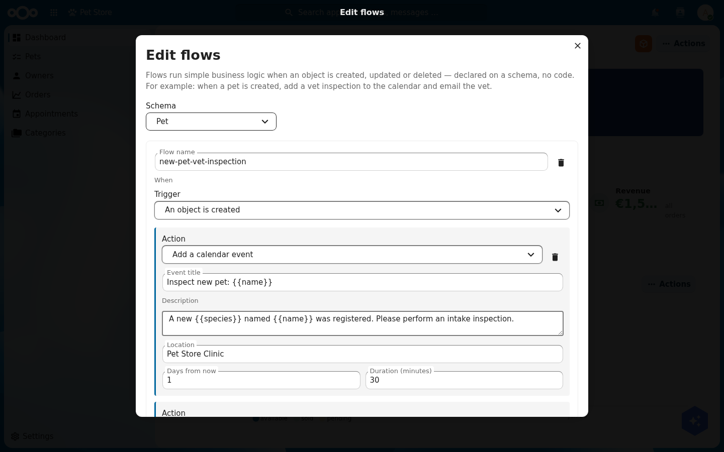
Placeholders like {{ name }} and {{ species }} are filled from the object
that triggered the flow. The calendar event action puts an agenda task in
the vet's Nextcloud Calendar; the email action sends the notification. Flows
never break a save: if an action fails it is logged and the others still run.
OpenBuild stores the flow on the schema as configuration that travels with the register, so an admin can review or change it later, no developer needed. The exact config format lives in the OpenBuild technical documentation.
Verify: create a new pet. An "Inspect new pet: {name}" agenda task appears in
the vet's Calendar for the next day, and an email goes out to the vet.
Step 11: Build it by talking to an AI
Everything you did by clicking in this tutorial is also available to an AI agent over MCP (Model Context Protocol). OpenBuild exposes its authoring surface as MCP tools, so you can build an app in conversation: "create an app called Pet Store, add a pet schema with these fields, add a Pets index page, put a stat and a chart on the dashboard." The agent calls the tools; the app takes shape.
The tools mirror the steps above:
| Tool | What it does |
|---|---|
createApp | Create the app and its first version (Step 1) |
upsertSchema | Create or update a schema (Step 2) |
upsertPage | Create or update an index, detail, or dashboard page (Steps 4, 5) |
addWidget | Add a widget to a page (Step 5) |
upsertMenuItem | Add a navigation entry (Step 4) |
promoteVersion | Release a production version (Step 7) |
listApps / getAppManifest | Inspect what exists |
Object data, schemas, and registers are reachable through the OpenRegister MCP tools as well, so the same agent can seed demo data and read it back. Building an app and talking to an AI about your data become the same activity.
You do not need an external client for this. OpenRegister carries an in-app AI assistant (the chat panel in the app), and apps feed their MCP tools to it through OpenRegister and LLPhant. So you can open the assistant inside your own app and ask it, in plain language, to change the app. Ask it: "Add a menu item called Built by the assistant that opens the Pets page." The assistant calls the openbuild.upsertMenuItem tool and the entry appears.
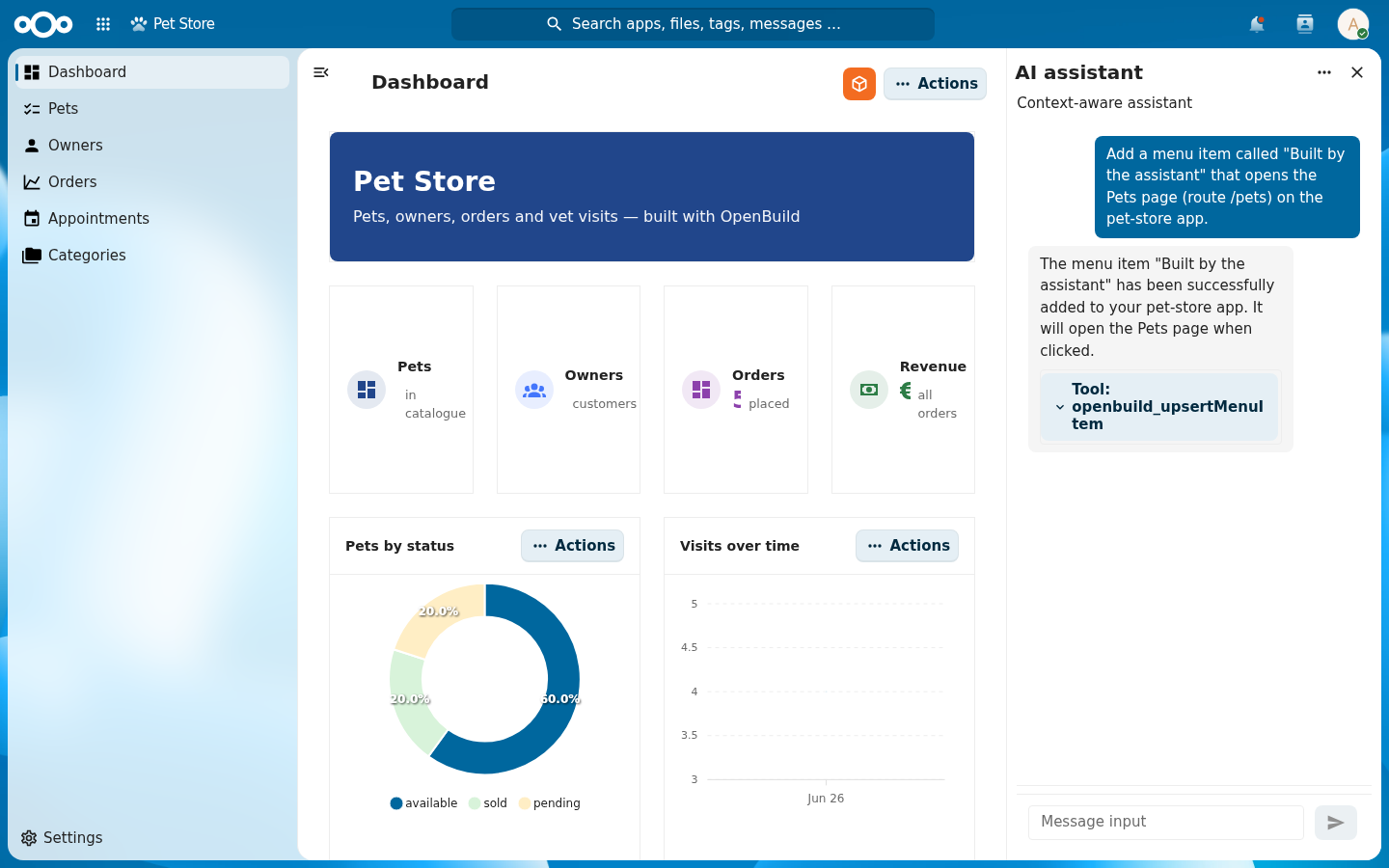
openbuild.upsertMenuItem MCP tool and confirms. The tool chip shows exactly which tool ran.It is not just talk: the entry the assistant created appears in the live navigation, between Appointments and Categories.

Verify: ask the assistant to list the virtual apps; it returns your Pet Store. Then ask it to add a menu item or a widget and reload the app; it is there.
These are not mock-ups. The two screenshots below were produced by calling the
OpenBuild MCP tools directly, no clicking in the UI. First, Create or update a menu item added a navigation entry:
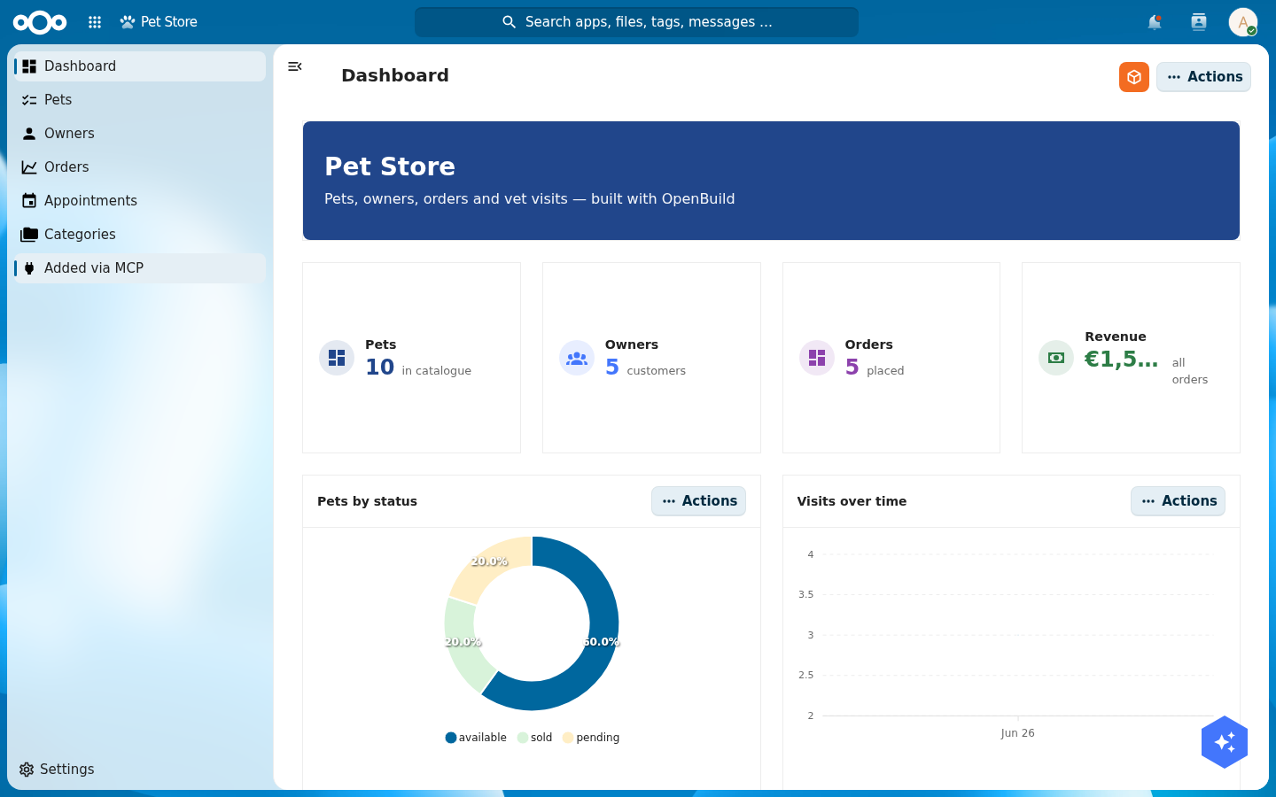
Create or update a menu item over MCP. The new "Added via MCP" entry appears in the live navigation.Then Create or update a page rewrote the pet detail page's header:
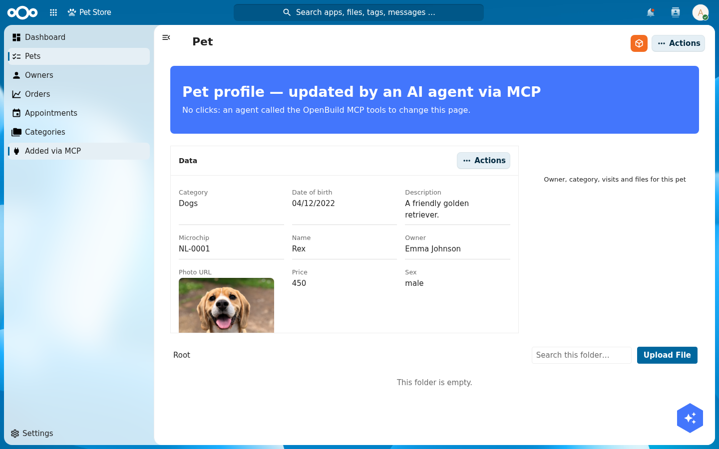
Create or update a page. The page re-renders with the new text on reload.Onboard your users: setup wizard, walkthrough, and support
Three first-run experiences ship with the app shell: a setup wizard, a guided walkthrough, and a support dialog. You configure all three from the same OpenBuild edit menu you used for pages and widgets. No JSON by hand. Open the orange edit button and pick the one you want.
A setup wizard for first run
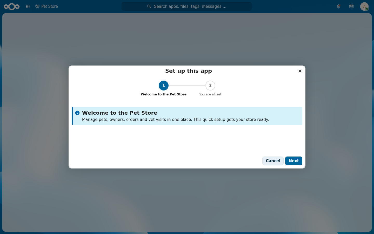
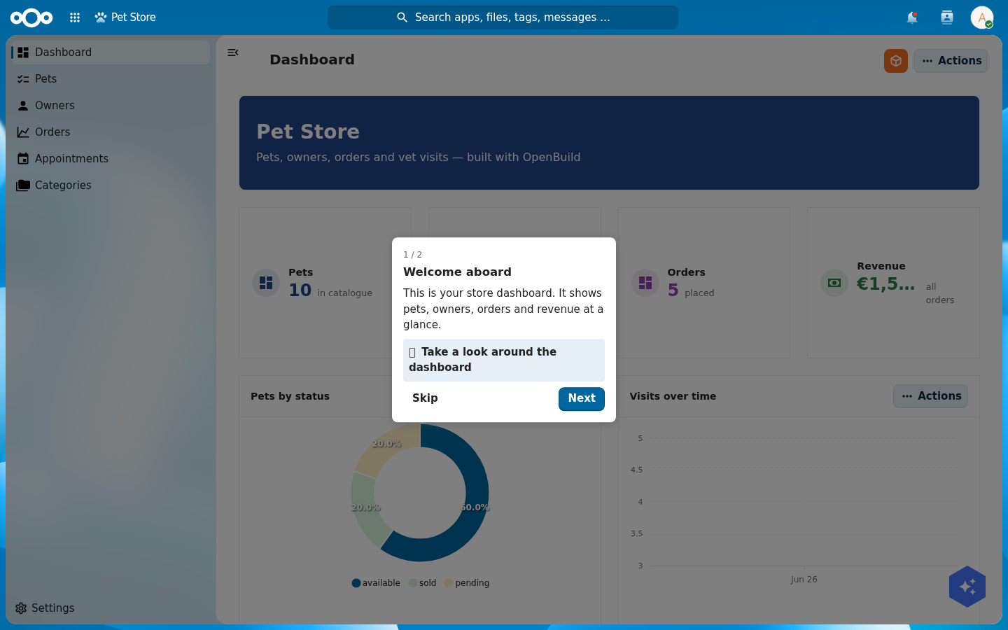
The setup wizard runs the first time a user opens the app. Open Edit setup wizard, then add a step for each thing the app needs before it is useful. Each step has a title, a body, and a type: a welcome (info), fill-in settings (config fields), a choice, a privileged action the app runs for you (run action), or a summary. Mark a step required and the app stays gated until that step is done. Leave it optional and the user can skip ahead and re-run it later from settings.
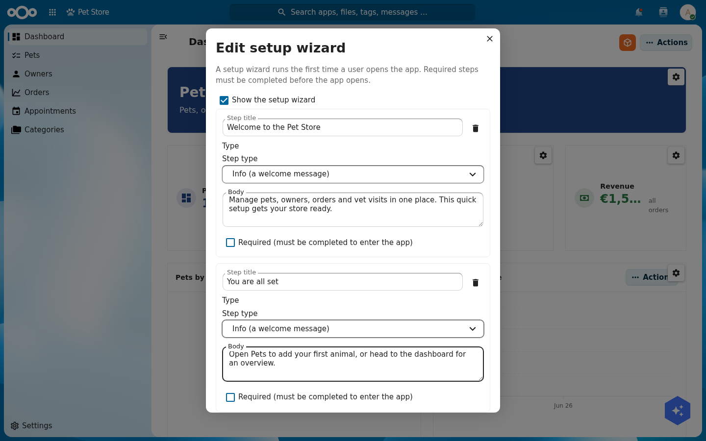
Click Done and the wizard is live. A user opening the Pet Store now sees the steps you wrote, with a progress rail across the top and a required step gating entry until it is done.
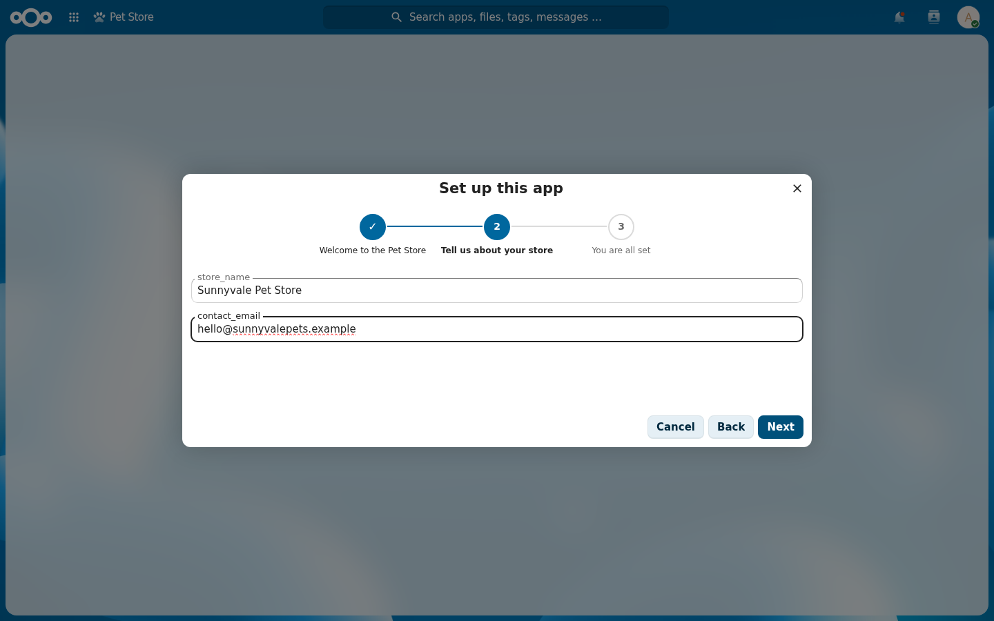
Ask for information. A welcome and a summary are nice, but the point of a setup wizard is usually to collect something. Add a step, set its type to Config fields, and list the keys to ask for (comma-separated, for example store_name, contact_email). The wizard renders a labelled input per key and saves them to the app's config when the user finishes.
Troubleshooting
The config step shows "Request failed with status code 404" on a virtual app. Config-fields write to an app config endpoint that a virtual (unexported) app does not serve, so saving 404s. Keep the step optional while the app is virtual, or use it on an exported app. The fields still render and collect input either way.
A guided walkthrough
The walkthrough is a guided tour: the page dims, the shell spotlights a target, and a coachmark explains the step. Open Edit walkthrough, give the tour a title, and pick when it runs (on a user's first visit, or after an app upgrade). Add a step for each stop. Each step has a title, a body, the one task for that step, and an optional CSS selector to spotlight. Leave the target blank for a centred coachmark.
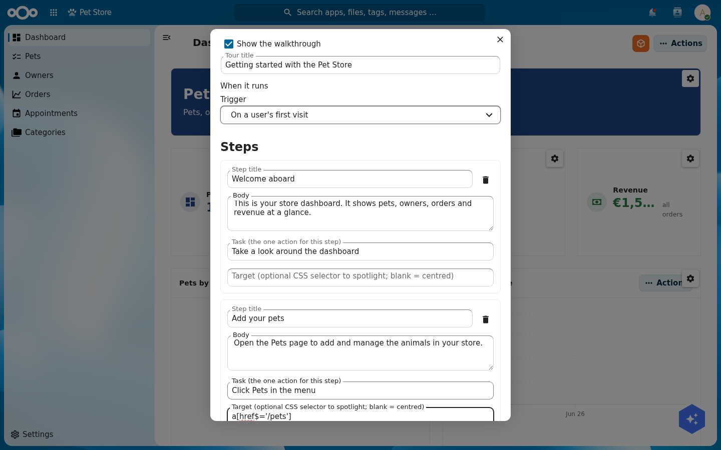
Targeting an element. The target is a CSS selector. The shell finds that element on the page, spotlights it, and pins the coachmark next to it. For the Pets nav item you can target the link by its route: a[href$='/pets']. To pin a step to a widget or button, grab a selector with your browser's inspector:
- Right-click the element you want to highlight and choose Inspect.
- In the elements panel, look at the highlighted tag for a stable hook: an
idbecomes#pets-widget, adata-attribute becomes[data-testid='pets'], a class becomes.cn-widget-grid. - Prefer an
idor adata-attribute over a class. Classes change when the design changes; ids and data hooks are stable. - Paste that selector into the step's Target field. Leave it blank for a centred coachmark with no spotlight.
On first visit the tour runs itself. The user sees your coachmark over the dimmed dashboard, with the task in bold and Skip and Next to move through it.
On a step with a target, the shell cuts a hole in the dimmer around that element and pins the coachmark beside it. Here step 2 targets a[href$='/pets'], so the Pets nav item is spotlit while the rest of the page stays dimmed.
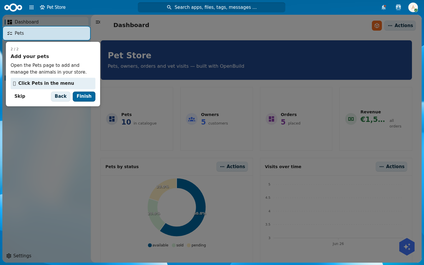
a[href$='/pets'] spotlights the Pets nav item; the coachmark points right at it.A support and donation dialog
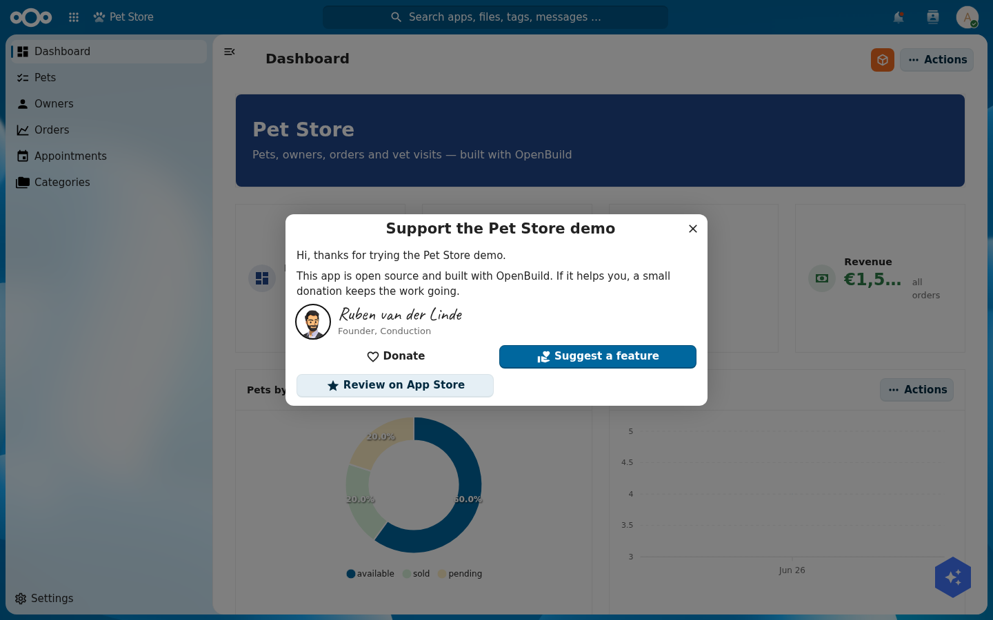
The support dialog is a one-time, dismissible note on first open. Open Edit support & donation to write it. The top of the editor sets the dialog title, the body text, and the signature: founder name, founder title, an avatar URL, and an Upload image button so you can drop in your own portrait. Every field is pre-filled with the current default, so you change only what you want. One toggle turns the whole note off.
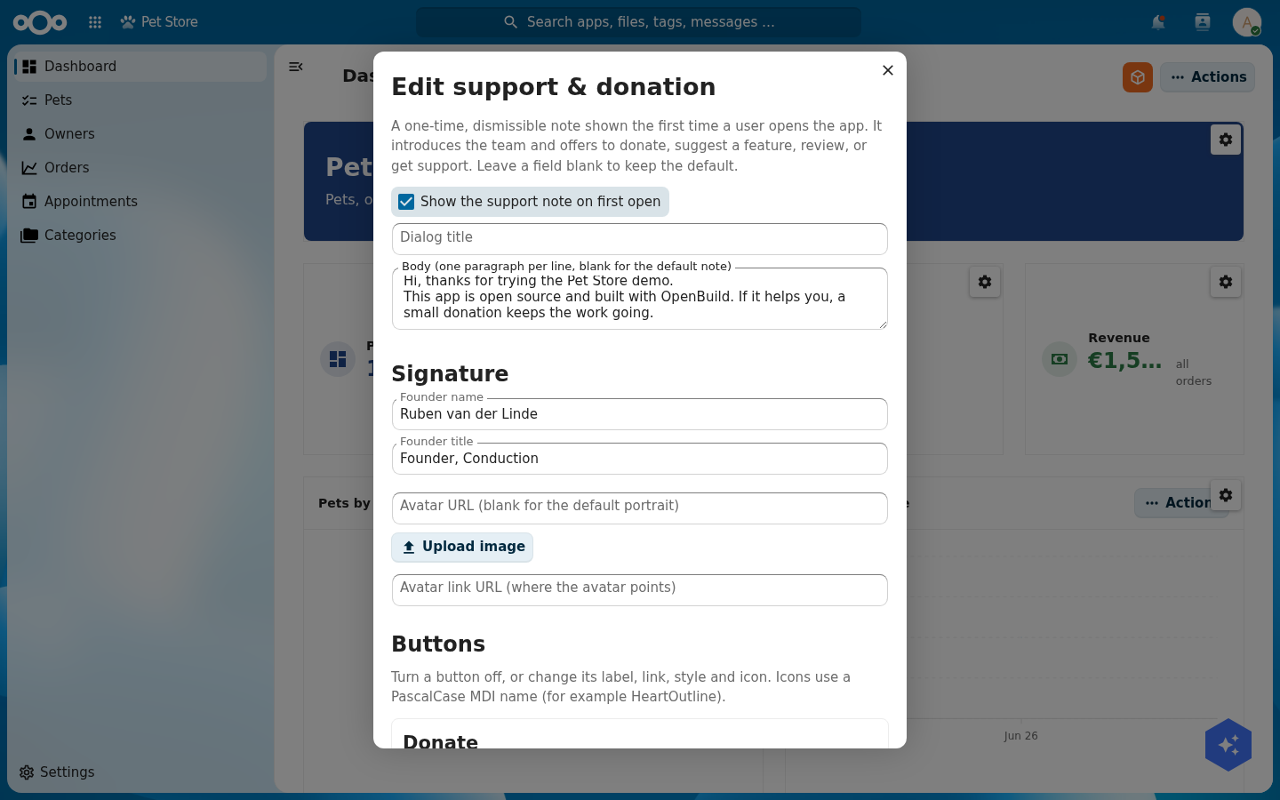
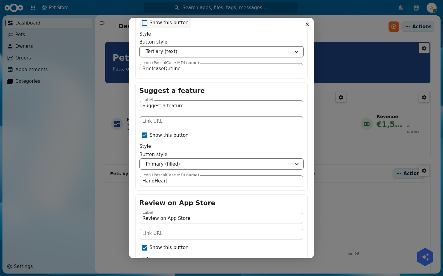
Below that, each of the four buttons has its own block: a show/hide toggle, a label, a link, a style (primary, secondary, or tertiary) and an icon (any MDI name). Turn a button off and it disappears from the dialog, so you can show two buttons or four.
A user opening the app sees the note once, with your title, copy, signature, and only the buttons you kept.
Test yourself
You have built the app if all of these are true:
- Opening the Pet Store shows a dashboard with live numbers and a status donut.
- The Pets list is browsable and a pet's profile shows its data, files, and related objects.
- A user in
vetsreads the medical records; a user outside it reads none. - The version history shows one production version.
- The Pet Store widget shows pets on your LaunchPad, a vet visit shows in Calendar, and a file dropped on a pet sticks.
- Creating a pet drops a "Inspect new pet" agenda task in the vet's Calendar and emails the vet.
- An AI agent over MCP can list your apps and add a widget to a page.